Redesign of Explore Learning website
Explore Learning began a project to redesign their website in order to strengthen their online presence and create a future-proofed platform that would boost member acquisition and retention while enhancing the customer experience.
I was part of the team that was tasked with this project, working alongside the Creative Director and the UX designer. My primary responsibilities involved production design, UI design, component library development, animation and prototyping.


The objective of the project was to redesign Explore Learning's website in a way that offered users an intuitive experience while also bolstering trust among parents and legal tutors.
The design strategy would have to feature replaceable modules and components in order to easily update and configure the website as needed on all of its locations around the United Kingdom. A mobile-first approach was used to optimise the adaptability and responsiveness of the website on any platform.

In order to achieve the project's objectives, we followed a collaborative process working closely with the stakeholders. That included ideation, workshops, wireframing and hi-fidelity prototypes.
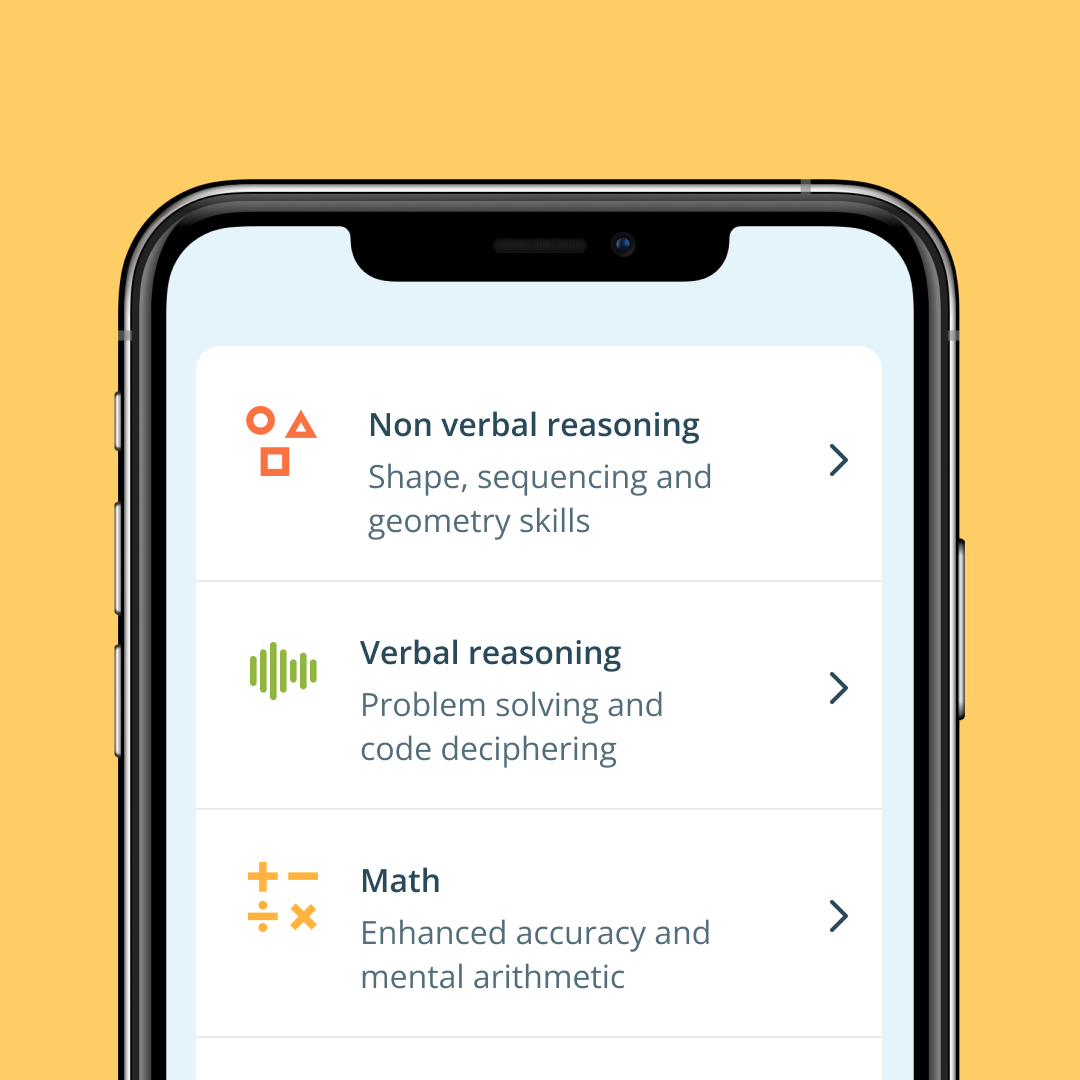
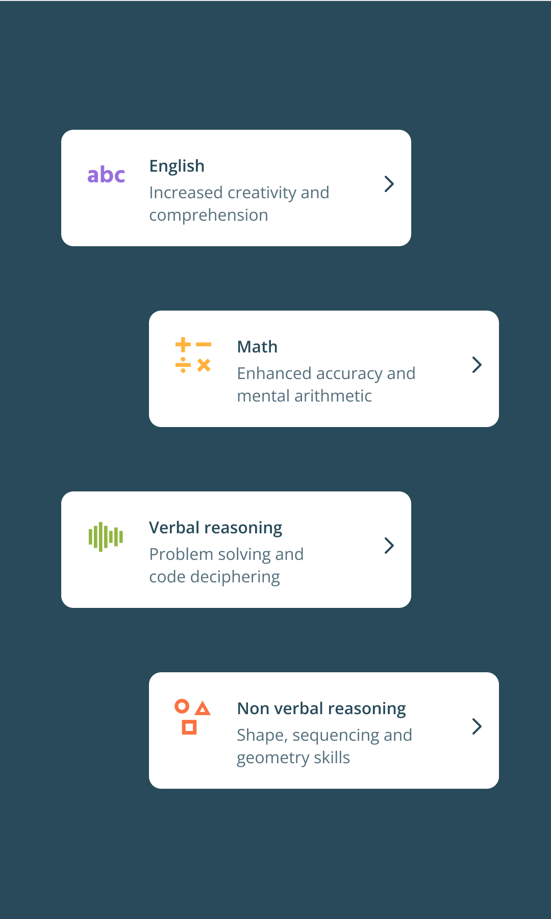
To make sure we were constructing a website that suited the requirements of the target audience, we began by developing user personas and identifying the more relevant user journeys.

The UX team crafted the low-fidelity wireframes to outline the organisation and design of the website.
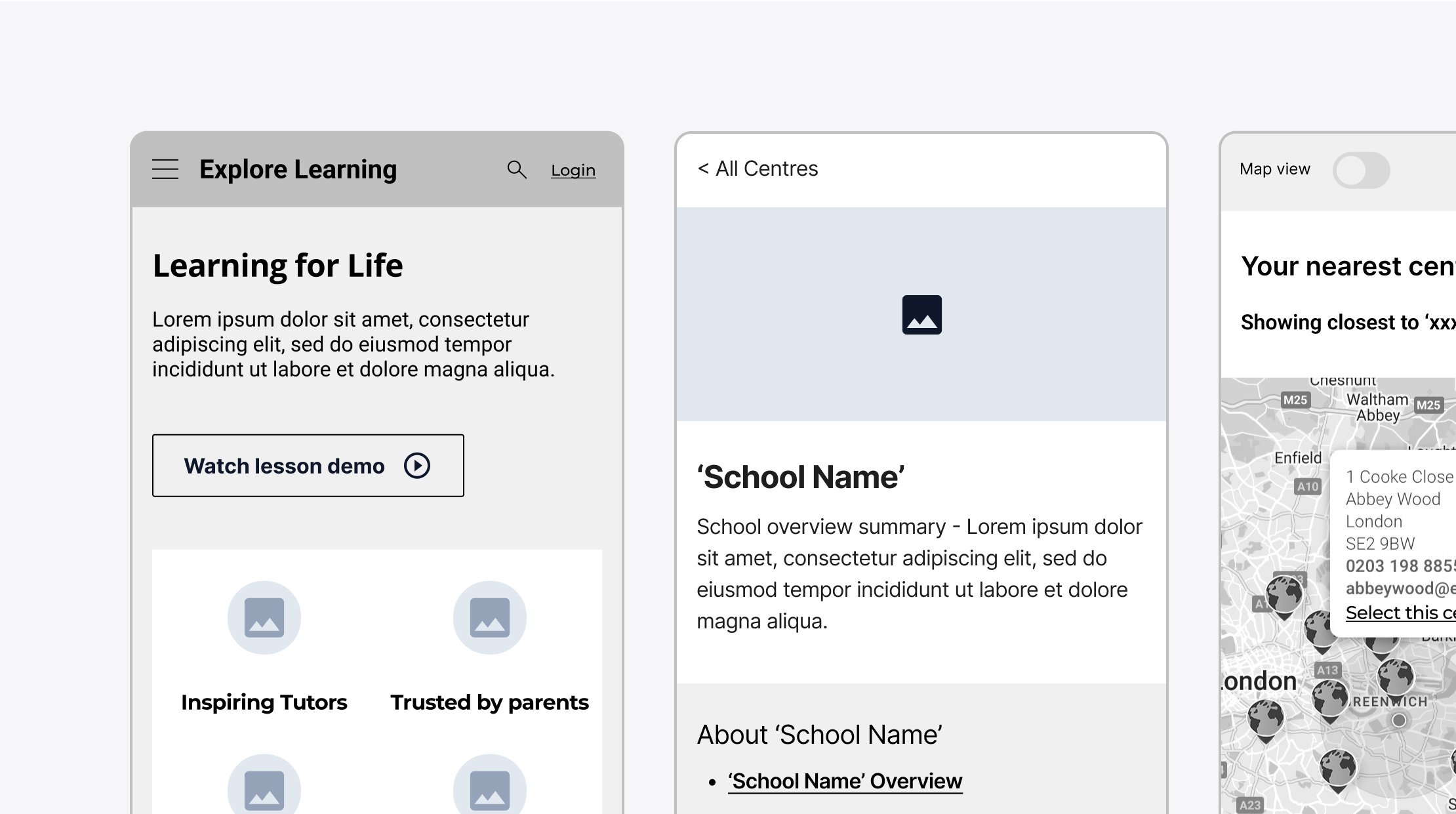
After establishing the framework and basic layout, we started working on the visual aspect of the website.
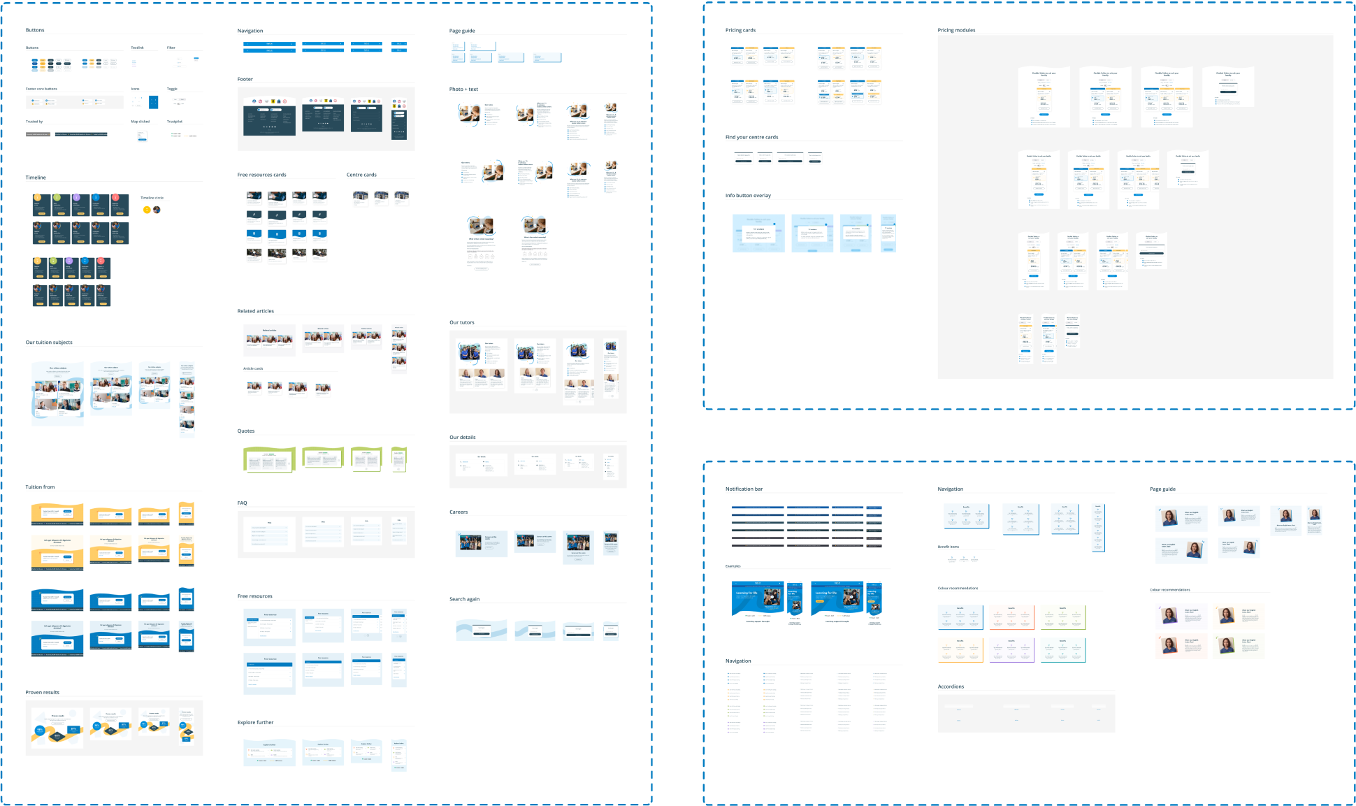
Our focus was aimed at the creation of modular design components. This ensured consistency and efficiency throughout the project, as these modules served as the building blocks for a cohesive and user-friendly online experience."


Following our systematic and reusable design approach, we built a centralized library to catalogue and organize the existing components and the addition of new elements.
We created the library in figma and turned all the elements into live components. With this method we kept a single source of truth, ensuring that all the updates made in library were automatically applied to all relevant pages across all files.
I was responsible for designing, maintaining and upgrading the component library so it that could be utilised to swiftly construct various website pages and rapidly make changes and iterations in response to client feedback.
We designed for the smallest screen size first and progressively scaled up to larger screen sizes.
My responsibility as a member of the design team was to maintain the established UI design aesthetic, utilising the smaller screen size designs to create the larger breakpoints in order to make sure the website was responsive and worked on all platforms.


.png)
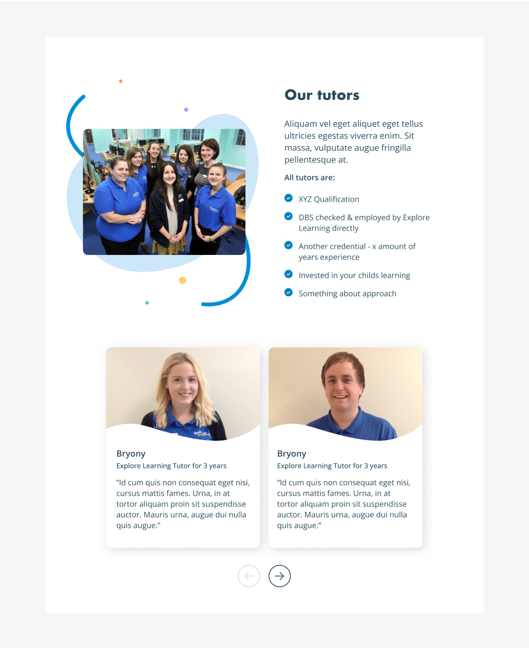
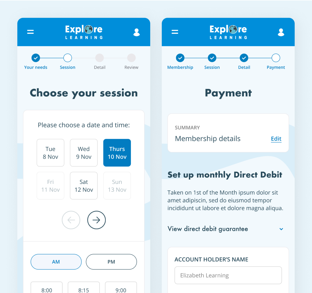
One of my roles was to design a price card component to guide parents through the process of selecting the most suitable learning path for their children.
The challenge was to balance between providing comprehensive information and maintaining a clean, intuitive design.
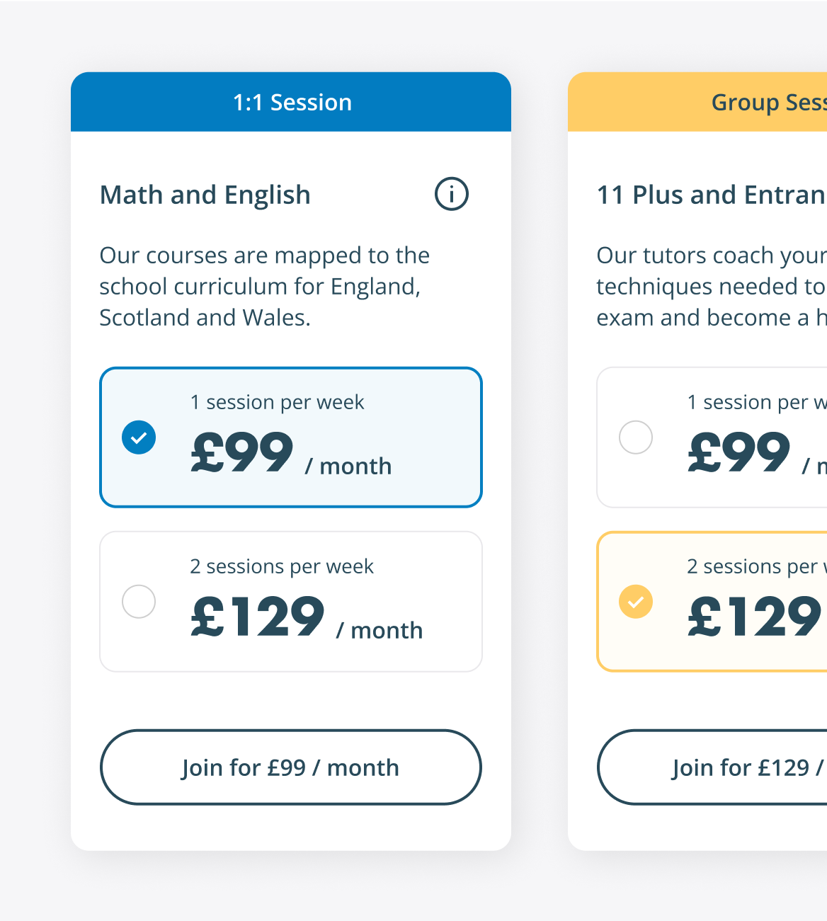

The price card component was integrated in a larger module that includes a set of toggles and interaction elements, forming a cohesive system that empowers parents to tailor their children's educational journey.
By incorporating intuitive controls, users can dynamically update and modify key aspects, including selecting the centre location, choosing between online or in-centre tuition, and exploring special offers.
The module also provides transparency in pricing by displaying both by session and monthly cost breakdowns, ensuring that parents have a comprehensive understanding of the financial commitment associated with their children learning path.
As a part of my responsibilities, I designed the visuals for the free trial, pricing, and member flows, ensuring an intuitive process for customers to register their children for online or in-centre lessons, from choosing a date and location to entering information and selecting a payment method.

One of my key contributions to the project was the creation of prototypes that helped us test various design concepts and respond promptly to customer feedback.
It allowed us to spot potential issues early on in the design process, saving time and lowering the possibility of costly errors down the road.
The prototypes also provided the client with a better understanding of how the website would look and function, which allowed them to offer insightful comments and valuable feedback.
Lorem ipsum dolor sit amet consectetur. Nisl augue duis velit ultricies id. Vehicula leo tincidunt ut morbi volutpat volutpat sit massa varius. Dui amet congue velit sit quis morbi sit donec.
Arcu velit lacus nibh sit in et. Mauris neque amet facilisis fringilla in varius tellus scelerisque. Amet sit ultrices tellus in.
At the end of the project the new website received positive feedback from users and stakeholders. The mobile-first approach and focus on creating a flexible, modular design have resulted in a website that is easy to use and looks great on all devices.
It was a challenging but rewarding experience that forced us to fuse creativity, user-centric design, and a touch of innovation to transform the online learning platform.
The project has been an exciting opportunity to work with a fantastic team and redesign a website that will have a positive impact on the education sector.


.png)